Client: Space Agency
Space Agency is a board game about space travel. The game has a retro-future feel to it, and needed a logo to match. In addition to the logo, I also created custom illustrations for the game.
Client: Temple View Capital
Agency: Kapowza
Temple View Capital is a real estate investment firm that serves most of the United States. They needed a logo that could communicate tradition and stability.
Client: Mason’s Legacy
Agency: Kapowza
Mason’s Legacy is a small non-profit that supports parents whose children have passed away. Their brand needs to suggest support and hand-holding without being overly prescriptive. The stencil nature of the mark also suggests building/rebuilding.
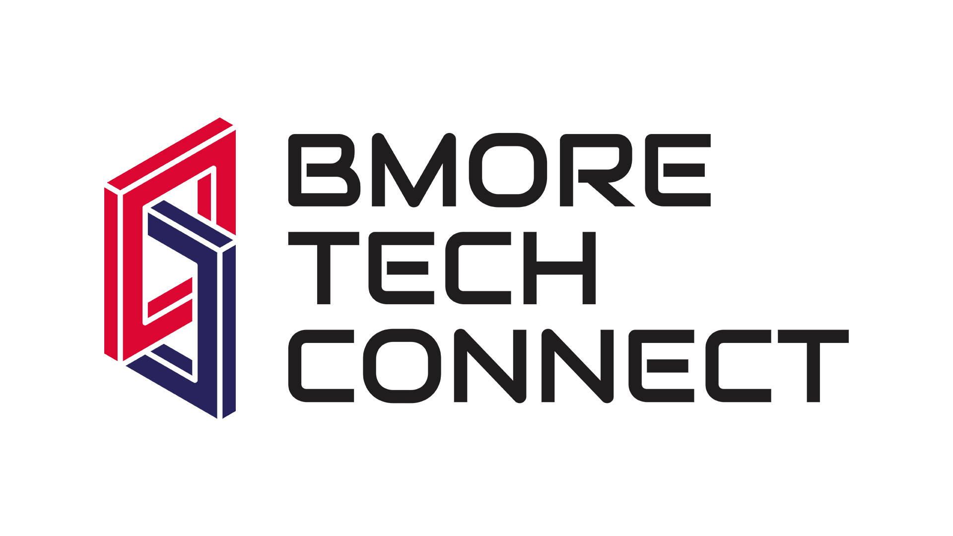
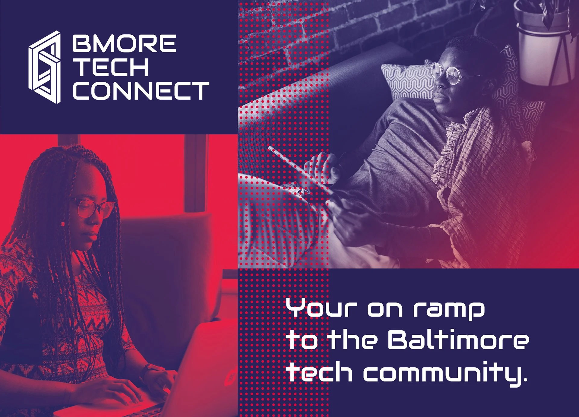
Client: Bmore Tech Connect
Agency: Kapowza
BMore Tech Connect is a platform that connects Baltimore’s tech community. Through discussions with the client, we settled on an isometric chain as a symbol of interconnectedness and technology.
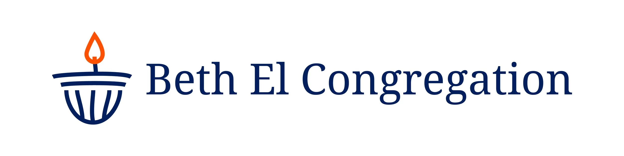
Client: Beth El Congregation
Agency: Kapowza
Beth El Congregation is a large, progressive, community-oriented synagogue. Their logo needs to appeal to a large range of people: old and young, current and prospective members, traditional and free-spirited. We chose an eternal frame, based on one in their own place of worship. The free-form lines give the logo an organic feel, while the thick lines convey confidence.
Client: Orbican
Orbican is a start-up aimed at curing cancer. The company is named after orbicular granite, so I drew inspiration from that for this mark. The client wanted a symbol that could convey growth, loss, intricacies, and research.
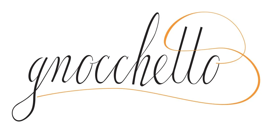
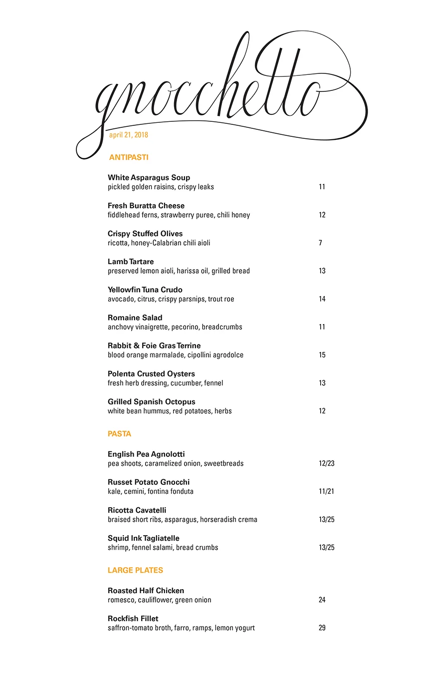
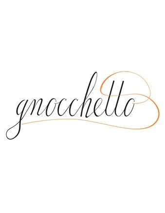
Gnocchetto was an award-winning Italian and Spanish restaurant in Baltimore. They needed a logo that communicated their upscale-yet-laid-back atmosphere. I drew the letters for this logo first in a sketchbook, then in Illustrator. I also provided the restaurant with flower icons to use as they saw fit, a label for the bartender’s house-made limoncello, and a basic menu design.